top of page

Overview
Currently working as the UX designer at HoneycombData Inc., I led the website redesign project to help enterprise-level cloud storage startup build a more intuitive information architecture and develop a coherent visual language. Previously, I designed and built the company's infographics and design system.
Sprint Duration: 3 months
Team: Cooperate with Songyi Agency
My Role: Project Leader, UX designer
Key Skills: Project Management, UX Research, Information Architecture, Concept Mapping, Content Production, Usability Test, SEO
Why Redesign
We are continuously evolving the core product while working on a new website to improve organic customer acquisition. As the product develops, we noticed that the old website could not display the product well with a relatively high landing page bounce rate of 65%. As a result, I made an audit for the old website and conducted several usability testing to gather pain points as below.

According to the usability test, the main pain points are:
-
The brand image is vague on the website.
-
The old website lacks details. Product information is a huge need.
-
The old layout cannot address information architecture fluently.
Redesign Focus

To better brainstorm and prioritize our ideas in terms of efficiency, I organized two workshops to narrow down our redesign scope and want to make sure that we are not only focusing on the website but also on the organization itself.
WORKSHOP #1: Design System
Consistency is one of the most significant design principles we are considering. To make our brand consistent both internally and externally, I integrated the design system with the current internal Cluster Management UI.

HoneycombData UI Cluster Management System - Bridge
Color System
I worked along with 1 PM, engineer team, and 2 other designers from the agency to consolidate our color system. Previously, our design styles were separated by platforms. For the color refresh, the main goal is to improve the design system and align the design system with other platforms.

Instead of using HCD Blue (#529CD6) as a tech-industry cliche color and HCD red (#DB5636) considered as the error states in the storage industries, we finally decided to use HCD Yellow (#F9BA16) as the primary color of the website. HCD yellow brings the concept of being bold and at the cutting-edge of the storage industry.
To better integrate with the whole design system, I also generated subjects color palette as the main color wheel in our future infographic designs.
Font System
The font family we use in the overall system is Barlow in regular and condensed medium weight. Considering the suitability, this time we used Arial for the website.

WORKSHOP #2: Information Architecture
Current Flow

Content Audit
To best demonstrate all the essential product features, I ran a content audit listing all available information and functions. Based on that, we collectively decided what to keep, what to kick, and how content can be integrated into more intuitive information architecture.

Site Flow Card Sorting
Restructured Sitemap
After all the researches and competitor analysis, I decided to add a new "solution" page to deliver more detailed enterprise solutions with case studies through industries.

Evaluation via Tree Tests
To ensure an intuitive understanding of the site's structure, I tested the sitemap on-site with potential users by giving them relevant tasks, such as "Where can you download the spec?" Based on the test results, the sitemap had been adjusted accordingly.
Site Map Wireframe

-
A more informative and "easy to understand" landing page where visitors can conveniently search for product detailed information.
-
Created the solution page on which visitors can check the use case of the product.
-
More CTA buttons ensure the visitors engagement.
Final Solutions
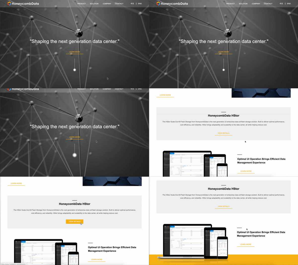
Increase our brand awareness and improve customer experience by redesigning a more eye-catching enterprise-level storage website. We want to make improvements both from a visual perspective but also build a more readable content.
Landing Page

Product Page


Impact

After the website became online, I also deployed the Google Analytics site tag in the header script to track website performance. In the first two months, the bounce rate of the product page was 30%, which is much lower than the old website. The conversion rate increased 170%, and user satisfaction was rated as 8.5 out of 10.
bottom of page